FLYBY
Brand Identity
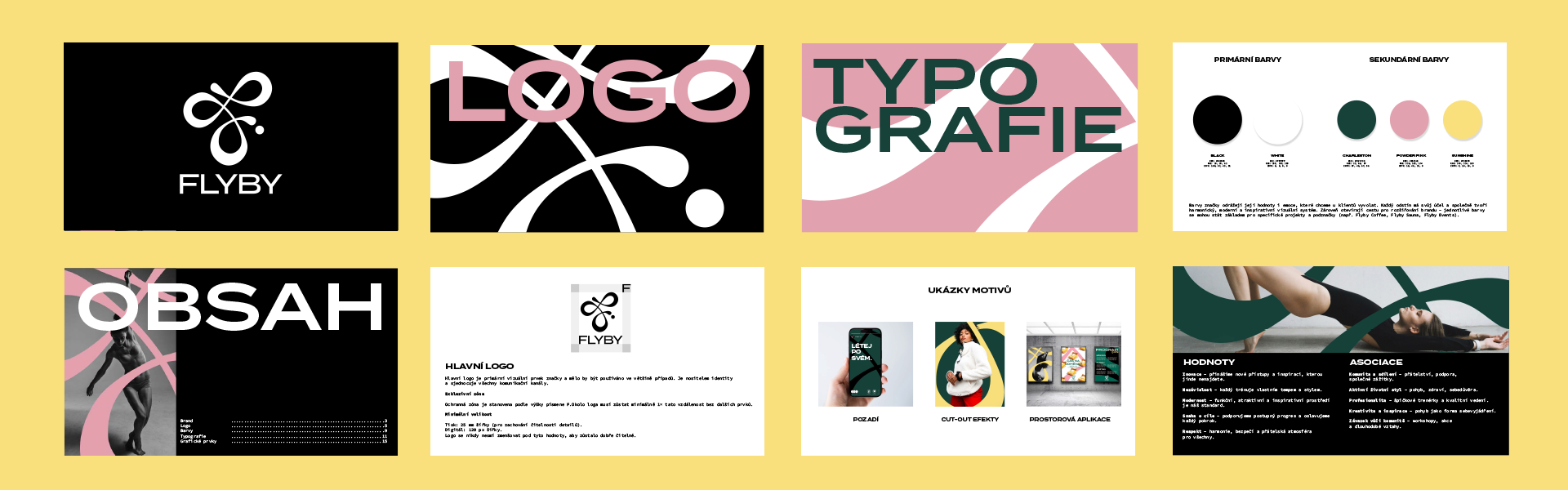
Pole dance studio, Prague
The brief
Flyby's founder came to me with a clear vision and a bold ambition: to build a pole dance studio brand that stood apart from everything else in Prague — and eventually, Europe. This wasn't just about a logo for a studio. She needed a visual identity strong enough to grow with the brand as it expanded into saunas, events, workshops, a café, and beyond. The brief was simple: bold, strong, distinctive. The kind of brand people remember.
The approach
I developed three separate brand routes, each rooted in the studio's core pillars — strength, femininity, movement and community. Rather than presenting a single direction and refining it, I wanted the client to have a genuine choice, with each route offering a distinct personality and visual world.
The chosen direction centred on a fluid symbol inspired by feminine strength — a form that captures the grace and power of pole movement without being literal or clichéd. It was important to me that this felt elevated, not novelty.
The outcome
The symbol became the heartbeat of the whole identity. Carried across the branding as a graphic element, it generates dynamic assets — adaptable, expressive, and always recognisably Flyby. Whether stretched across a poster or reduced to a stamp on a coffee cup, the mark holds its own. The result is a brand with the flexibility to move into new spaces while keeping a strong, cohesive visual voice.